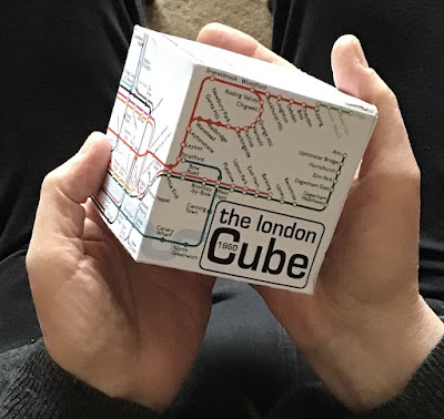
Seeing The Cube, it is instantly recognisable for what it is - a map of the London Underground. Looking at it, you soon see it is like no other map. It offers no explanations. There is no legend. You, the viewer, are left to interpret what is what; to provide your own explanations.
When I was designing The Cube, my first act was to create a grid of equal sized squares. It could not be of a square or a rectangular design, so I needed to find another design solution, which I did by chance and, given what The Cube is, I consider the solution reasonable.
It is my design and I have stamped my ownership on it in various ways, all visible, some more than others.
That I think linear when it comes to maps is understandable many ways:
It was the first map I ever saw, probably as a baby going into Wembley Central or Alperton stations. They were large. Outside the stations, in the ticket halls, on the platforms, in the trains (not the L.M.S. electric trains* running to Euston or, occasionally, Broad Street, which ran on the same rails and shared the same platforms as Bakerloo line tube trains between Watford Junction and Queens Park for most of my childhood).
I saw the station names on London Transport roundels and pointed. My mother, when I saw her, took me on days out. Seeing her was always associated with treats. She would point with me and say ‘Alperton’, ‘Park Royal’, ‘North Ealing’, ‘Ealing Common’, ‘Acton Town’ and so we would go on, every station. No wonder my mother spent a lifetime telling me and anyone who would listen that I could read an Underground map before I started school aged five in 1949. I could read London Transport bus maps too. The London Underground was part of my education.
The Underground map also shaped how I saw London and, by and large, it made sense. I associated some stations with names and special places. I still do.
I could go on, but I’m pretty sure what I say about myself is also true for many others as well. The Underground Map is not just a collection of coloured lines and names. It is our lives.
The original Underground map by Harry Beck is a work of art; an icon. Never bettered.
Contemporary London railway maps are, sadly, overcrowded with lines and too much small print, making much of the information unreadable as far as many of those looking at the map are concerned, albeit understandable, the map has become as confusing as a maze.
What I hope I give you with The Cube is a London you can hold in your hands. It will get better I promise, but at 78 I cannot afford to wait until I have perfected my creation, so when you hold The Cube think of it like the world it tries to encapsulate - less than perfect, striving to be better.
Robert Howard. Cube map designer.
NOTE. * The pedantic reader may want to say the L.M.S. Railway was nationalised in 1948, which is true, but the old brown L.M.S. electric trains with sliding doors, which rarely stayed closed, continued to run in their old livery into the 1950s, when they were withdrawn. Anyway, during my younger years, the old names of railway lines and companies persisted. It was a long time before ‘British Railways/B.R.’ replaced the old company names in common parlance.

No comments:
Post a Comment